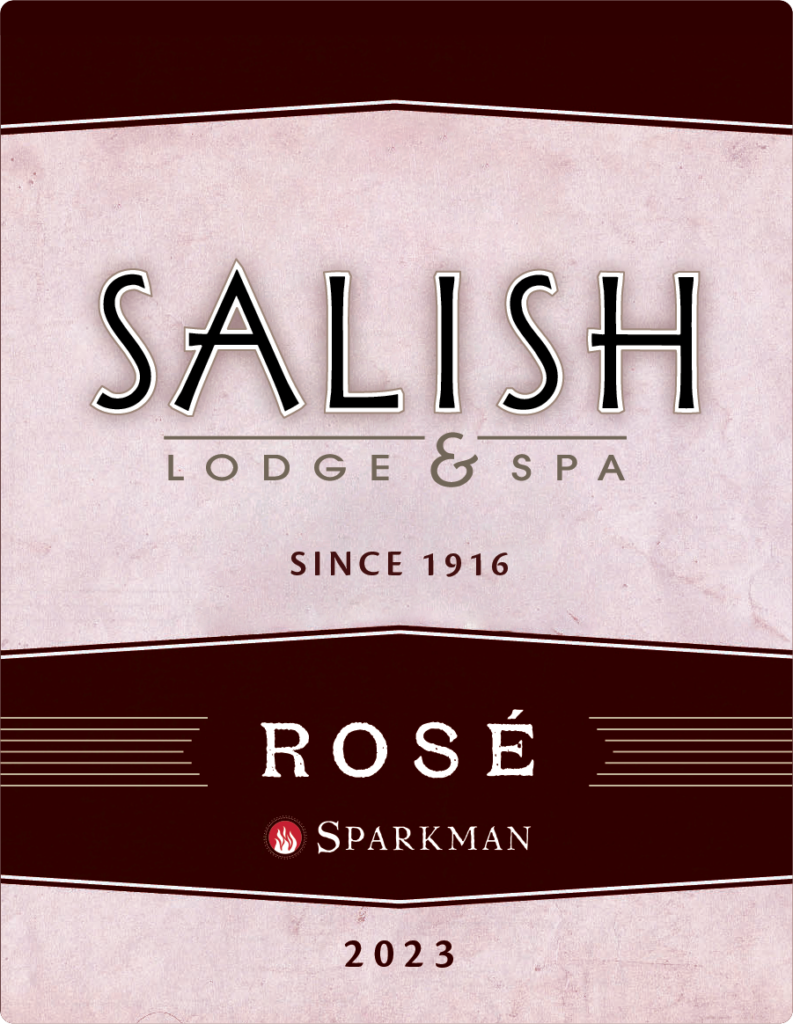
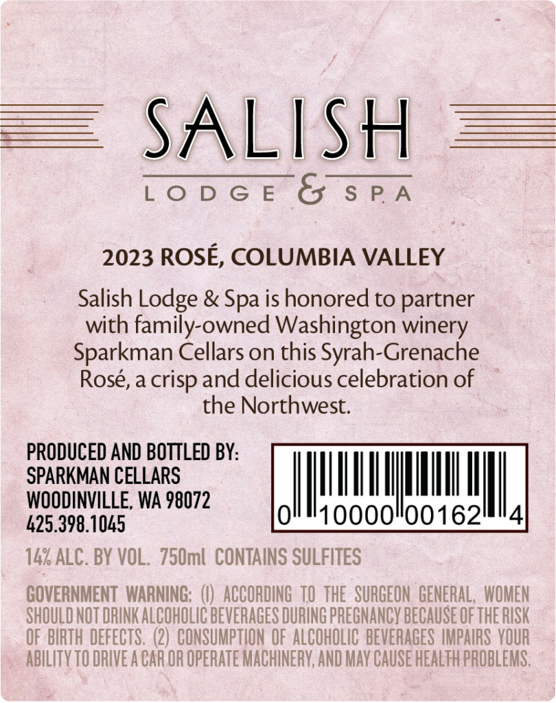
The Rose Wine Label project has been such a wonderful learning experience! The Lodge has a line of their own branded wines and bubbly, such as a Red Blend, Chardonnay, Brut, and Brut Rose. The newest addition to this lineup is a still Rose. I was asked to create the label for this bottle. The labels for the other branded bottles have a similar look to them, and this new label needed to match. I started with the file for the Red Blend label, and got to work editing elements. The first snag I ran into is that the text on the label was no longer editable. It was important that the Rose title on the front match the other labels, but I was not able to create the same look on my own. The workaround was to reach out to the manufacturer of the Brut Rose label for the native file. I took the Rose from the bubbly file and placed it on the label so that the distressed look matched. The pink tint from the Brut Rose for the background of the label was added so it matched. I photoshopped the image of the Falls out, per the boss’s request, and added ‘since 1916’ too. For the back of the label I spoke with a representative at the winery about what the labeling should say, particularly the technical elements required for labeling wines such as %ABV, the grape varietals, and region of origin.
The gift shop provided a fresh barcode. The winery’s label was included on the front. This project was a lot more work than expected, but well worth it for the experience. I was able to get in contact with lots of people to make this happen. I gained experience collaborating with management for the desired aesthetic, as well as experience with the technicalities of wine labeling. I gained experience in Adobe Illustrator and learned how to combine elements from inherited files to make something fresh that coordinates with branding guidelines and current stock. Lastly I gained experience corresponding with the graphic designer at the label printer. I’m pleased that this turned out well. Looking forward to seeing it in person on the bottle. Will update with a picture when that happens.
I made a simple graphic for the boss with specific figures relevant to the goals of the new year.
Using branding elements and colors I made several choices to choose from. Boss chose bottom right as the one to use. This graphic is displayed on each morning’s powerpoint presentation.
I created this logo to match the other outlet logos at the Lodge, shown at the top. There are 3 different fonts used for these logos. For the new Restaurant logo I created several choices, each featuring these fonts, with a mix of upper and lower case letters.
It was fun to ask different team members and management what their favorite of the bunch was. I got a lot of different feedback, and I was surprised with how varied the results were.
My personal favorite was the top left. Boss chose top right. All current Restaurant menus have this logo.
Canva Projects
This 8.5 x 11 sign was created for the Visitor’s Center to advertise the Honey Month specialty drinks. I used branding colors and fonts except for the scripted Honey. I had fun searching for just the right graphics to include. Honey is key theme at the Lodge because of the on-site apiary and is an important element in the food and beverages.
This was the first project that I did for the Lodge. It was a print ad in the local 425 magazine. The final print version was edited some by the Marketing Manager, but this is what I came up with. This was my first introduction to using branding elements like colors and fonts and stock photos.
Adobe InDesign Experience
I’ve gained additional software experience in InDesign working on extensive documents like the Banquets Catering Menu. I did not create this file, but I updated it extensively. This project gave me a lot of experience with InDesign. I became much more proficient working with images in this program, which is set up differently than other Adobe programs. I also got a lot of experience working with text with heavy formatting.
I work extensively in InDesign with the main menus for the Lodge. As with the Catering Menu I didn’t create these files, but I have updated them extensively and reworked the formatting to suite current needs. The Brunch Menu is a good example of this, as well as The Lounge Menu and the In Room Dining Menu.
Currently I’m working on a Compendium for the Lodge. This file I created and set up with a parent page and appropriate branding elements. The content is being edited and updated continually. This project is really good experience for me because I’ve learned how to create complex content and combine documents from multiple sources in a comprehensive way.
The Fire Pit menu was a nice learning experience because I leveled up in InDesign with this project. I got better at manipulating images and text, as well as border and decorative line features.
I collaborated with the Food & Beverage managers for updated content. I also worked with the receiving manager to size appropriately for specific frames, and the marketing manager to make sure everything is print-ready for the printers.
Talk to me
Have any questions? I am always open to talk about your business, new projects, creative opportunities and how I can help you.